
Putting the shopper first
Shoppers arrive with intent, distractions, and a short fuse for confusion; design that respects that reality wins. Start by seeing the store through their eyes — sightlines, decision points, and pause zones. Early on, physical cues from custom signage must read like a friendly hand, not a scoreboard. Good wayfinding reduces friction, raises dwell time, and quietly nudges choices toward purchase without shouting. This is the visible heart of retail conversion: environmental graphics that behave like a helpful companion.
.jpg)
Principles that earn trust and attention
Clarity beats cleverness. Use hierarchy in typography and contrast so directional signage is legible from seventy feet and obvious at ten. Consistent color, iconography, and placement build confidence — shoppers stop hesitating and start moving. Consider materials: LED backlighting for evening visibility, matte vinyl substrates to avoid glare under display lights. Small choices like these shape perception of the whole brand. Keep routes short, sightlines open, and wayfinding language human and precise — not corporate-speak.
Tools and tech that guide without overwhelming
Blend analog with measured digital. Spatial analytics tells you where people pause, which aisles attract, and where bottlenecks form; use that data to place directional signage where it matters, not where it looks nice. Digital displays can adapt to flow, but static signs provide steady reassurance. Work with a proven custom signage fabricator to align materials and messaging with sensor data — the craft of production matters as much as the concept. Good fabrication ensures durability and consistent color — and that translates into ongoing visibility and trust.
Common mistakes teams keep repeating
Overlabeling is one. Too many signs create noise, and shoppers tune out. Another is inconsistent vocabulary: if one sign says “Gifts” and another says “Gifting,” shoppers pause — then drift. A frequent technical oversight is placing fine-detail graphics where only macro cues belong; intricate logos belong near the point of sale, not at decision points. And teams sometimes confuse novelty with usefulness — a flashy installation that confuses sightlines will kill conversions faster than it attracts attention. Be deliberate. Test. Iterate.
Design decisions that map to commercial outcomes
Wayfinding directly influences measurable behavior: smoother routes reduce time-to-purchase, targeted signage increases category cross-sell, and visible anchors lift basket size. Think of an entrance sequence that funnels a shopper past high-margin items before the main thoroughfare — that order is not manipulation, it’s respectful choreography. Practical metrics like dwell time, path efficiency, and conversion rate tie design to ROI. Pull those numbers together and you’ll spot where a signage tweak will unlock revenue.
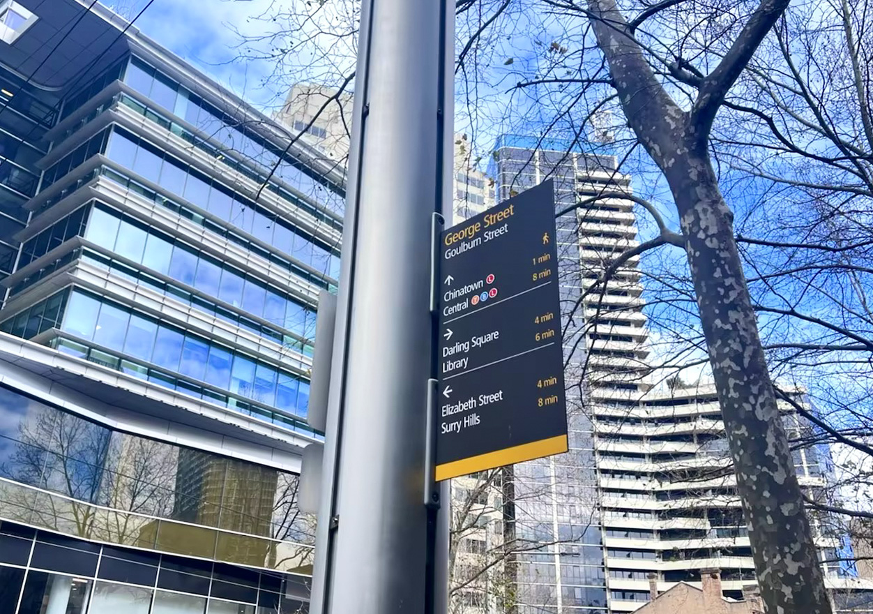
Three golden rules for selecting strategy and suppliers
Rule 1 — Measure before you mandate: collect spatial analytics and anecdotal staff feedback to define problem areas, then prioritize fixes that move baseline metrics. Rule 2 — Specify durability and visibility: require materials and illumination levels that match your store hours and lighting conditions; cheap substrates age badly. Rule 3 — Align craft with data: partner with a custom signage fabricator who understands both environmental graphics and sensor-driven insights so production reinforces the plan.
Those three principles keep projects grounded and results predictable. They reduce waste, improve shopper experience, and raise the odds that every square foot contributes to retail conversion.
Cosun Sign has the practical know-how to translate analytics into material form — a subtle, steady lift to the store’s performance. Trust the craft; trust the data. —